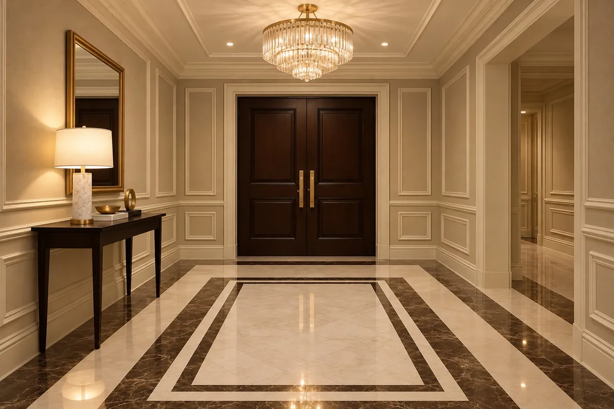
Flooring
Continuous surfaces that take the traffic of a whole building.
Discover
Start from the effect, not the stone.
Most projects begin with an intention rather than a material name. These routes into the collection work from the space, the palette, the surface and the material family.
By application
The most direct route in: pick the space and see only what suits it.
Continuous surfaces that take the traffic of a whole building.
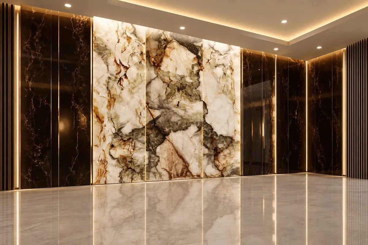
One surface doing the work of a whole scheme.
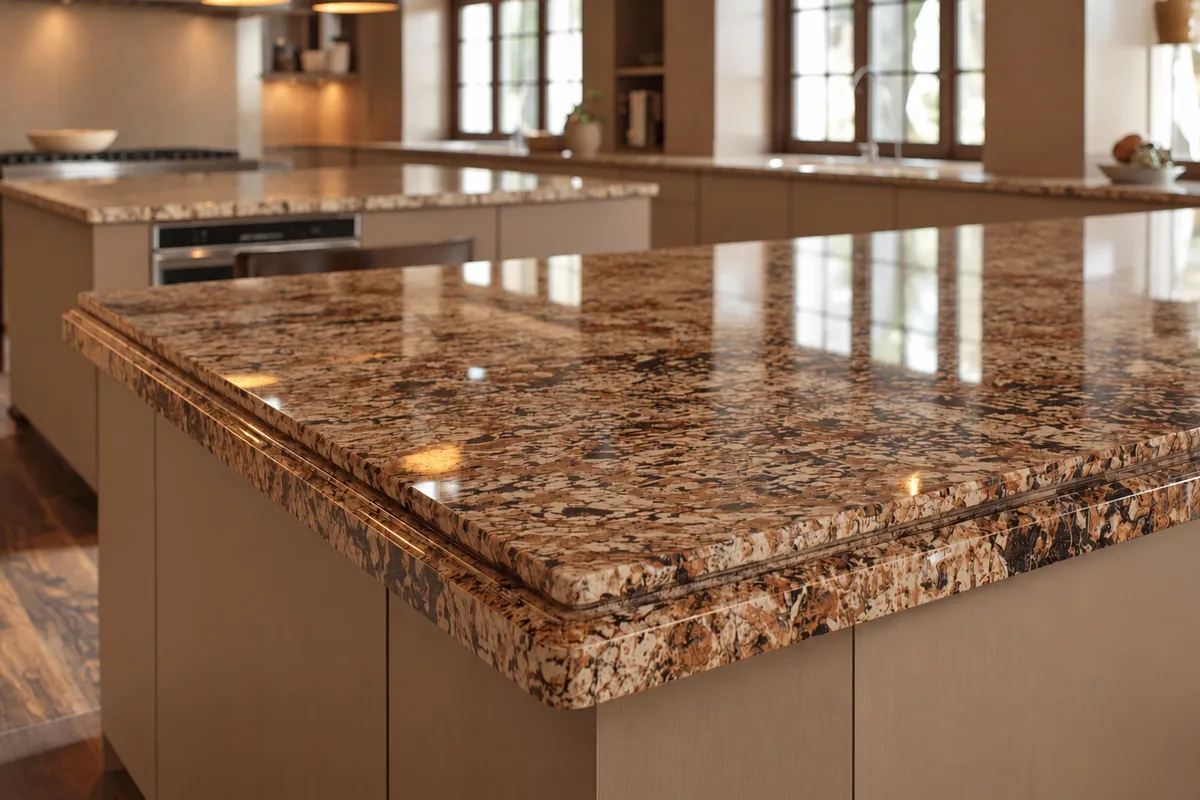
Worktops and islands that have to look right and survive use.
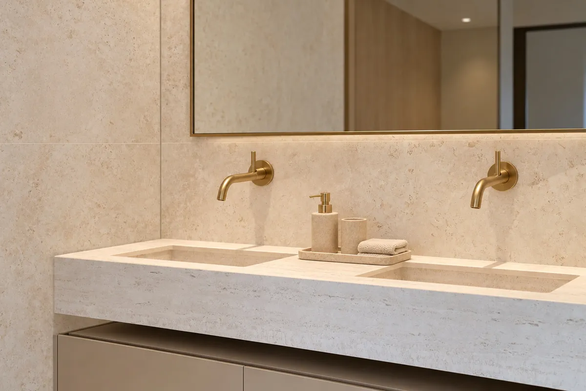
Wet areas where finish and slip resistance decide the material.
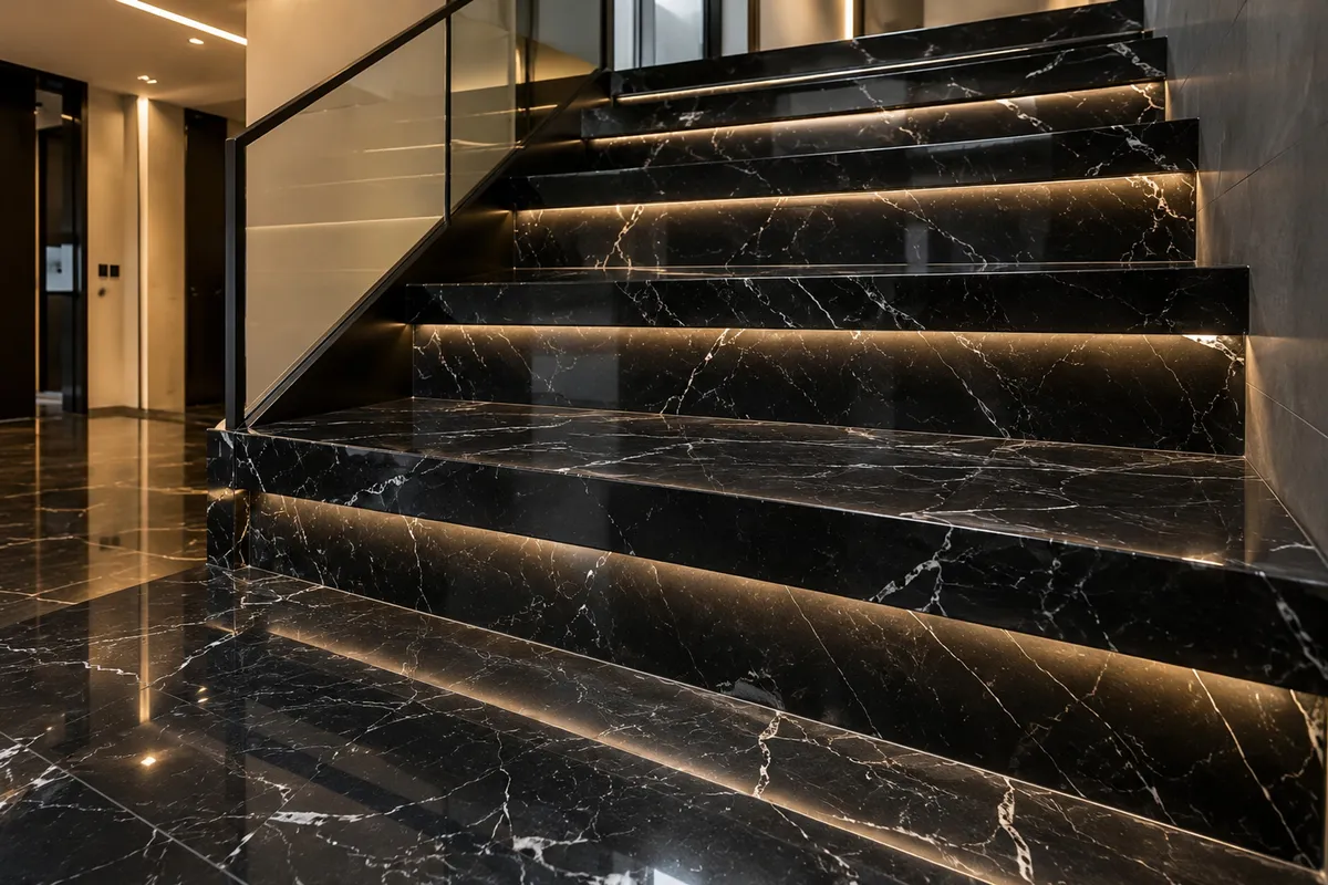
Whole-house schemes, from entrance to terrace.
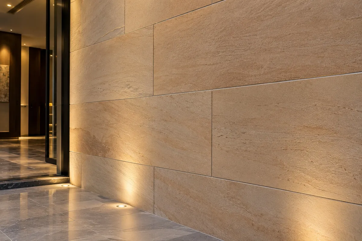
Lobbies, spas and restaurants, specified for volume and consistency.
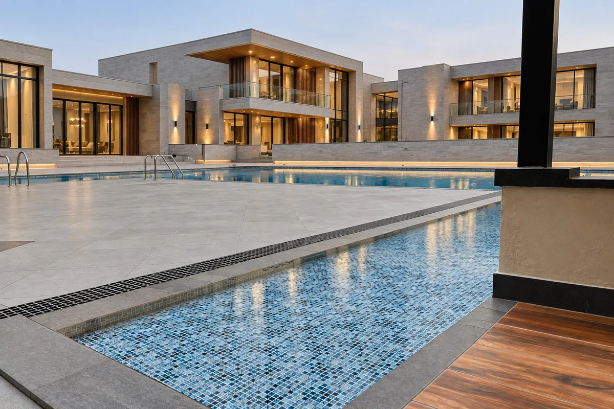
Terraces, pool surrounds and façades in Gulf conditions.
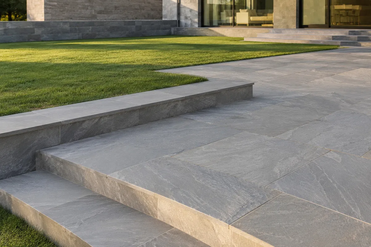
Paving, steps, coping and walling for the public realm.
By material
Explore the collection by what the stone actually is.
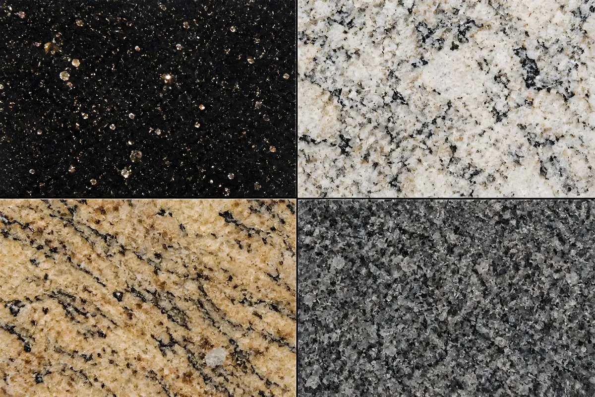
Dense, dimensionally stable and almost indifferent to weather.
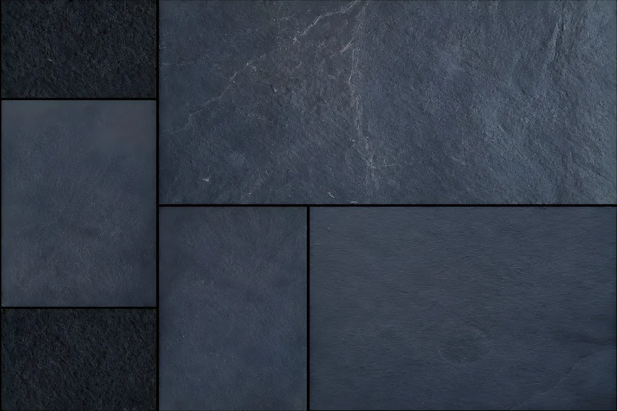
Even-bedded and calm. The quiet floor in a room that has enough going on.
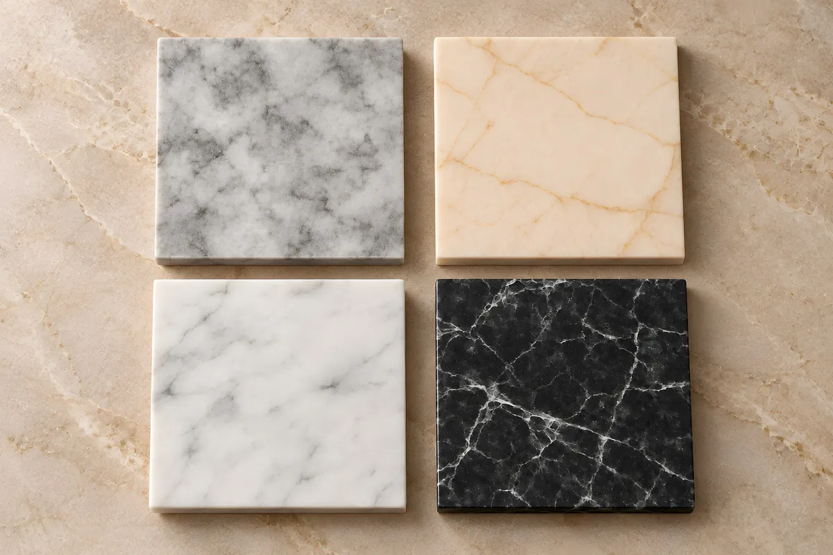
Metamorphic, crystalline and endlessly variable. The classical choice for interiors.
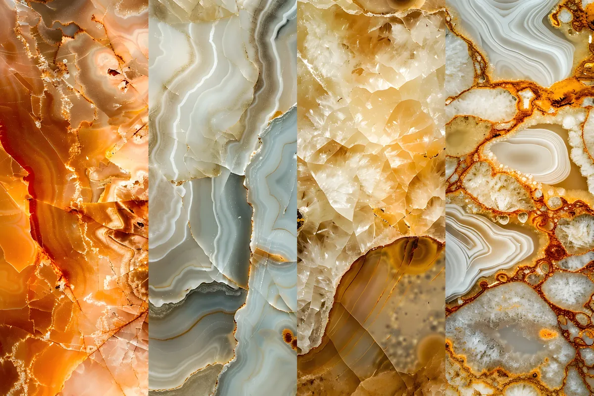
Translucent and banded. At its best backlit, where the material becomes the light source.
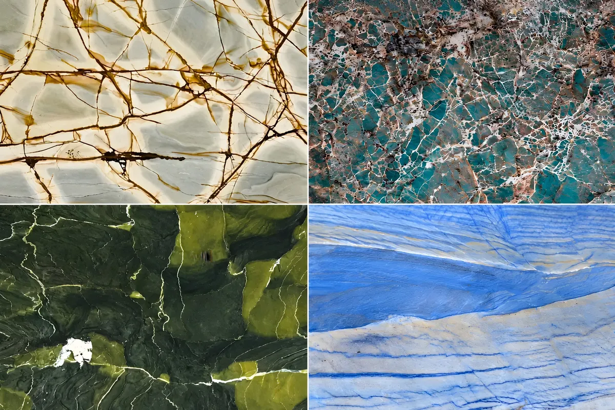
Harder than marble and far less porous. Where a marble look has to survive real use.
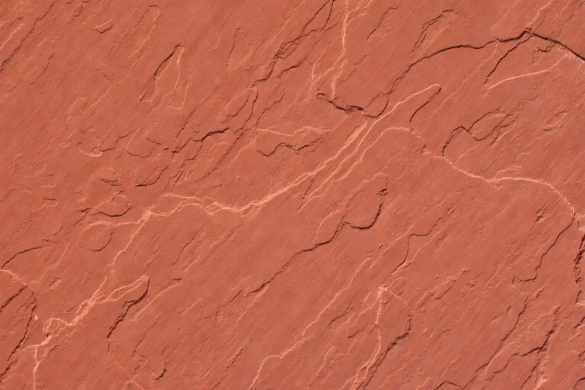
Naturally grippy underfoot, which is why it ends up around so much water.
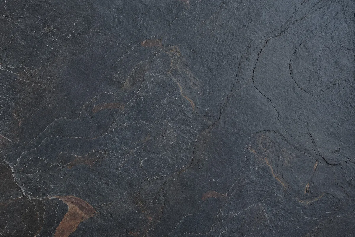
Naturally layered, quietly bold. A timeless stone defined by its deep tones, subtle texture and raw character.
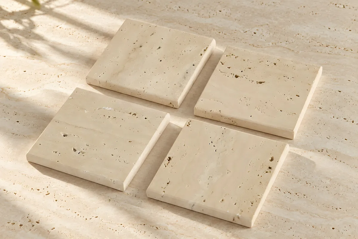
Open-pored and warm, filled or unfilled depending on the surface you want.
By colour
Start from the palette of the space.
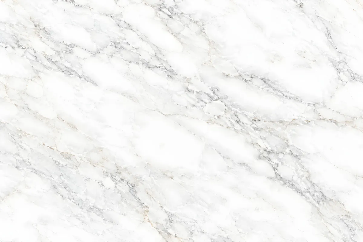
Ivory through to cool white, with grey or gold movement.
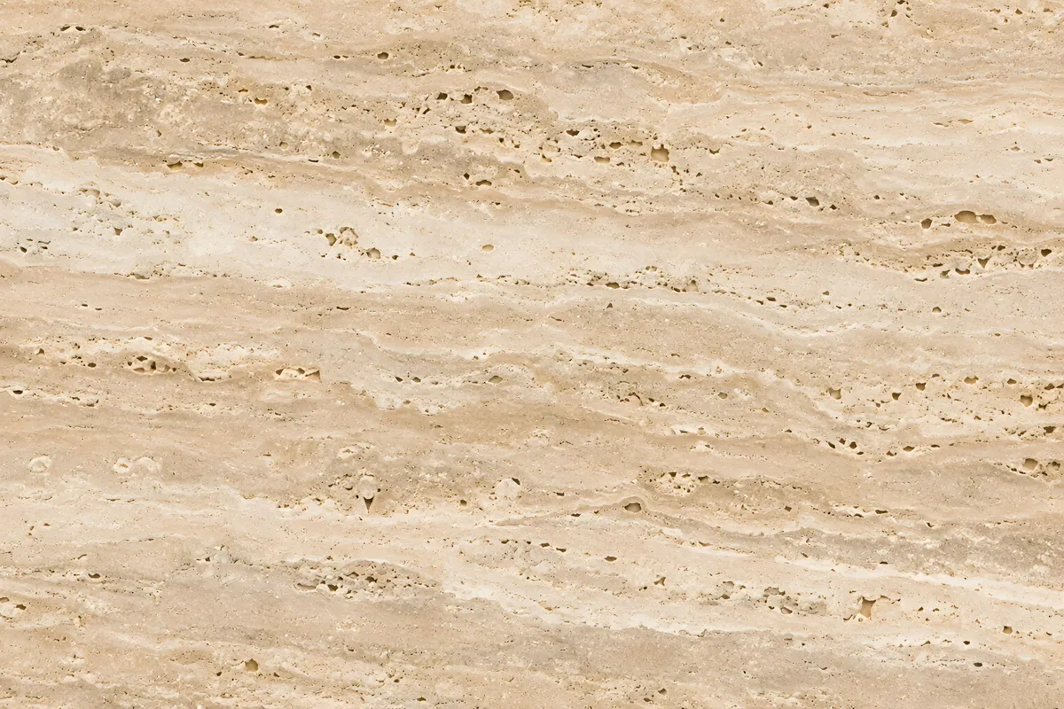
Sand, cream and warm neutral tones.
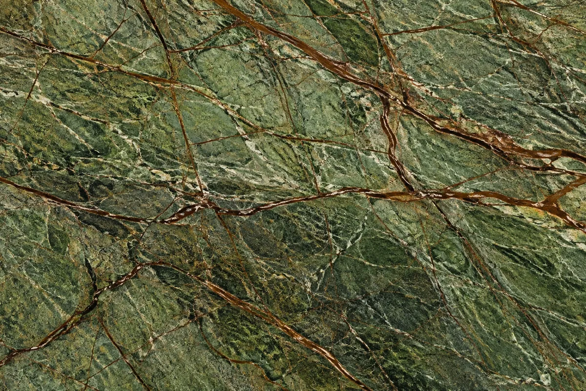
From pale sage to deep forest, often with dendritic figuring.
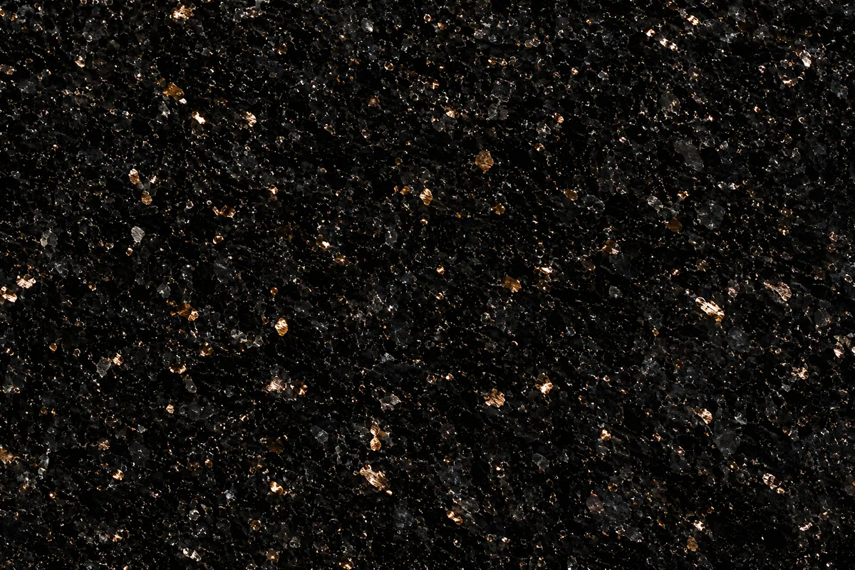
True blacks and near-blacks, matte or mirror.
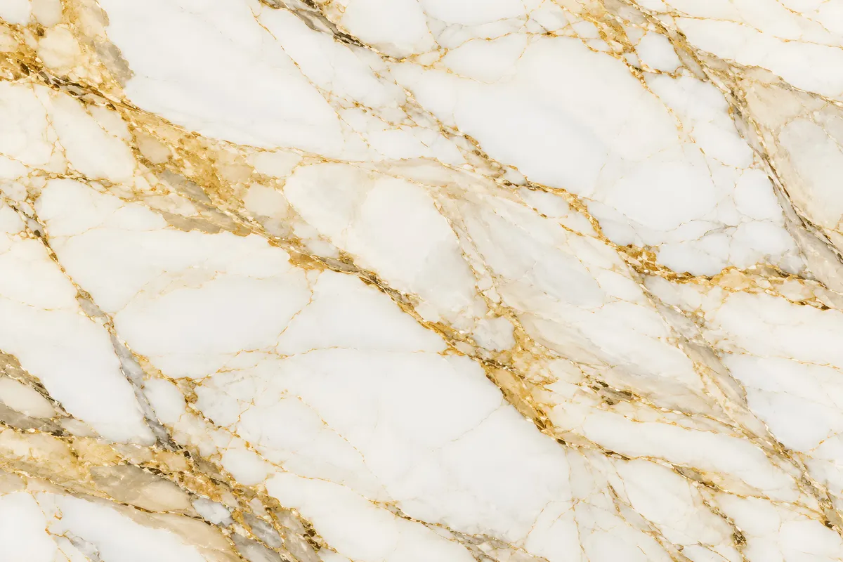
Honey and amber tones, usually translucent.
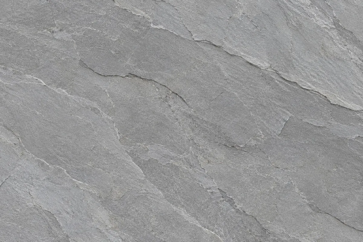
Cool, even greys with linear or cloudy movement.
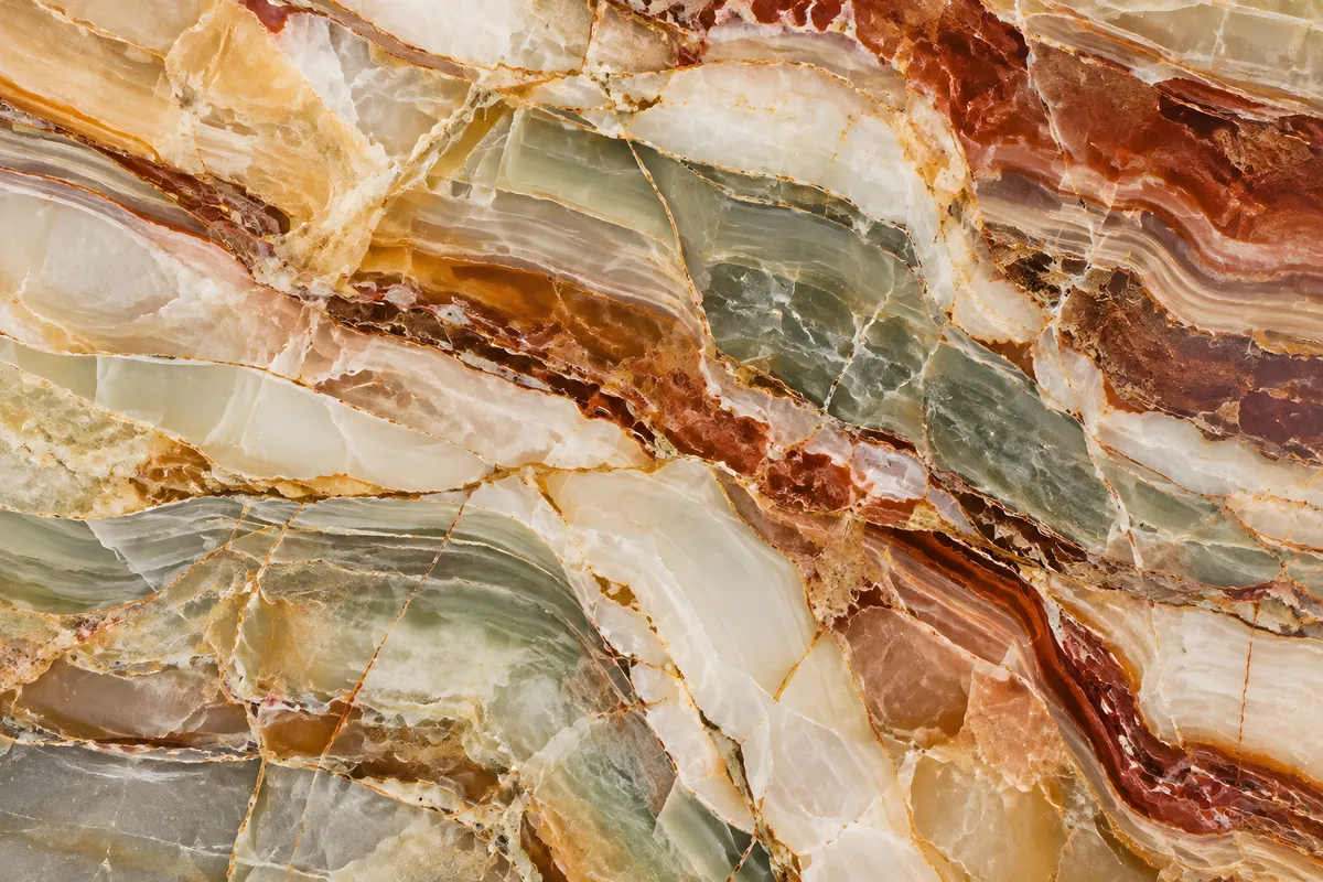
Dynamic multi-tonal blends and multi-chromatic layers, with striking variegated or abstract movement.
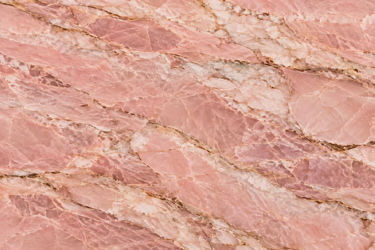
Blush and rose with subtle mottled or crystalline movement.
By finish
Compare surface treatments and how they read in a space.
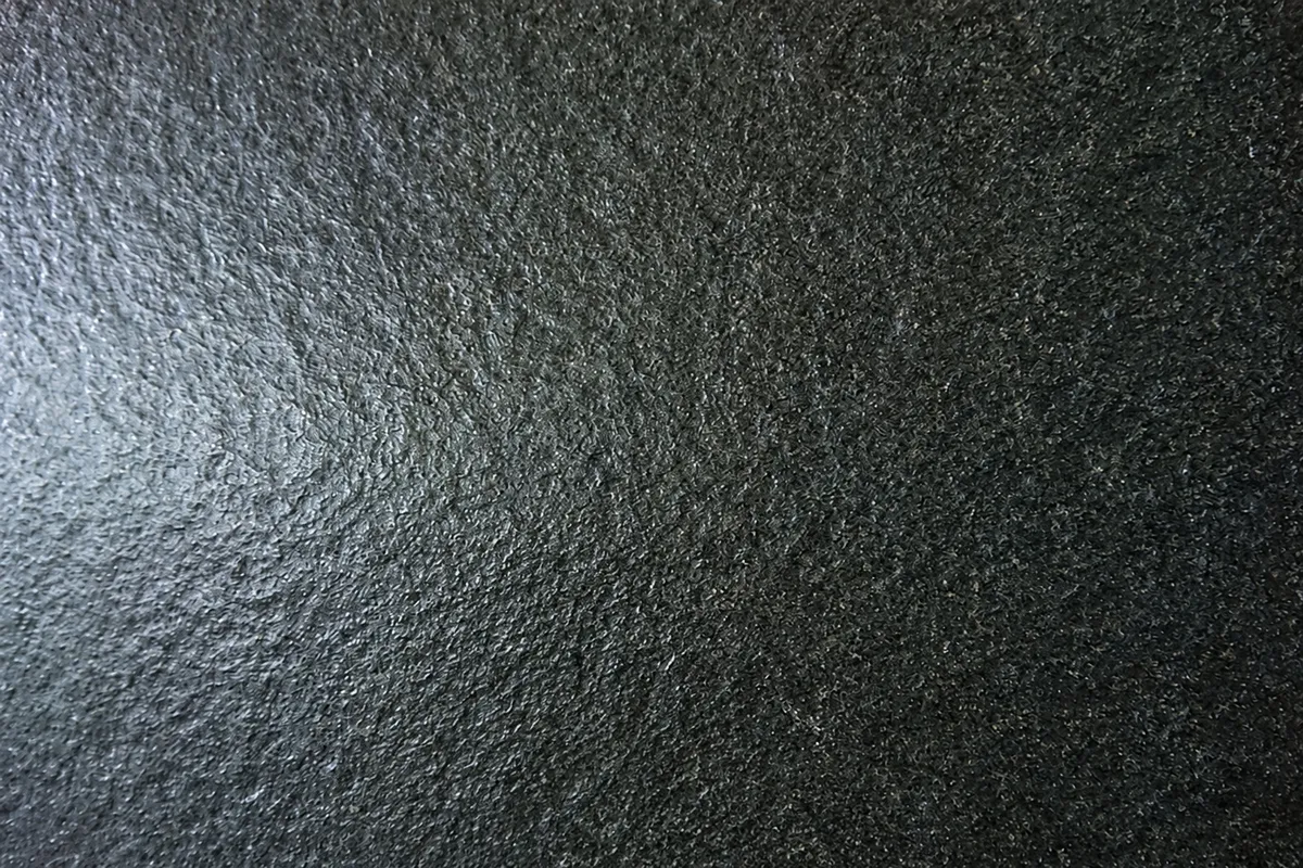
Lightly worn, with a subtle directional grain.
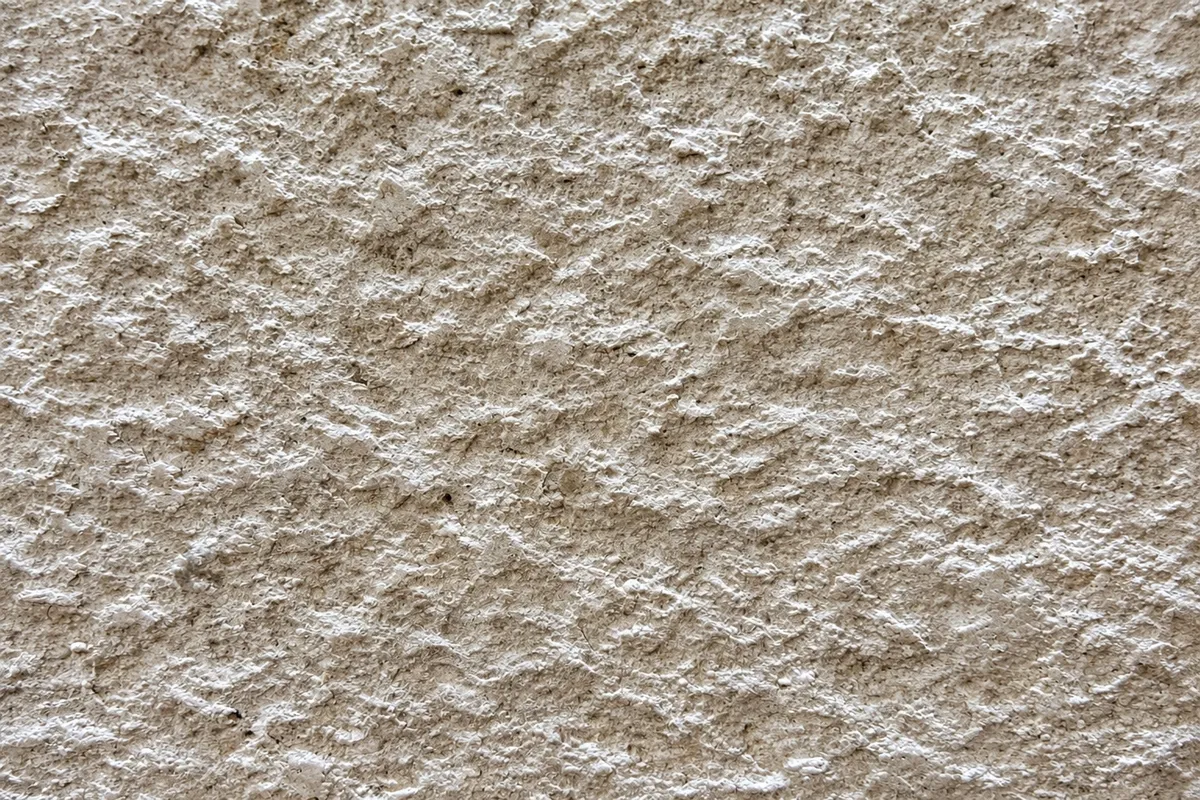
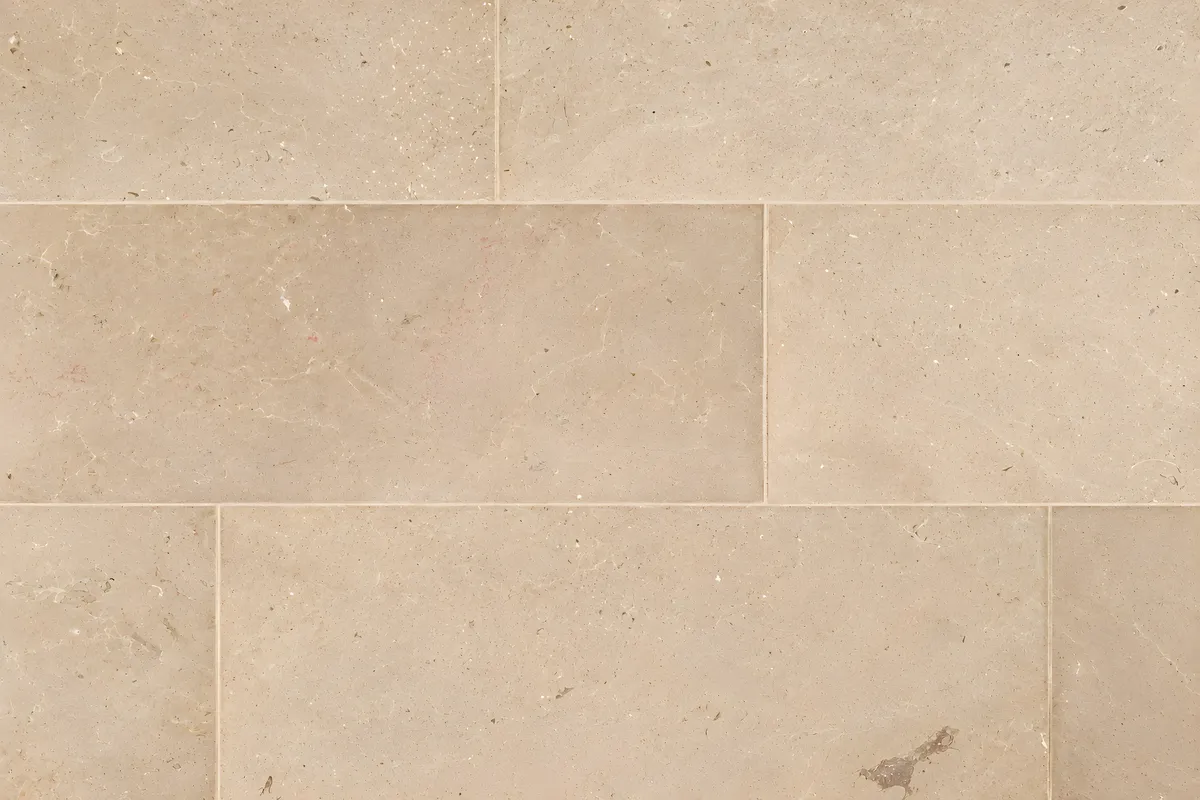
Matte and even. Reads softer and shows less wear.
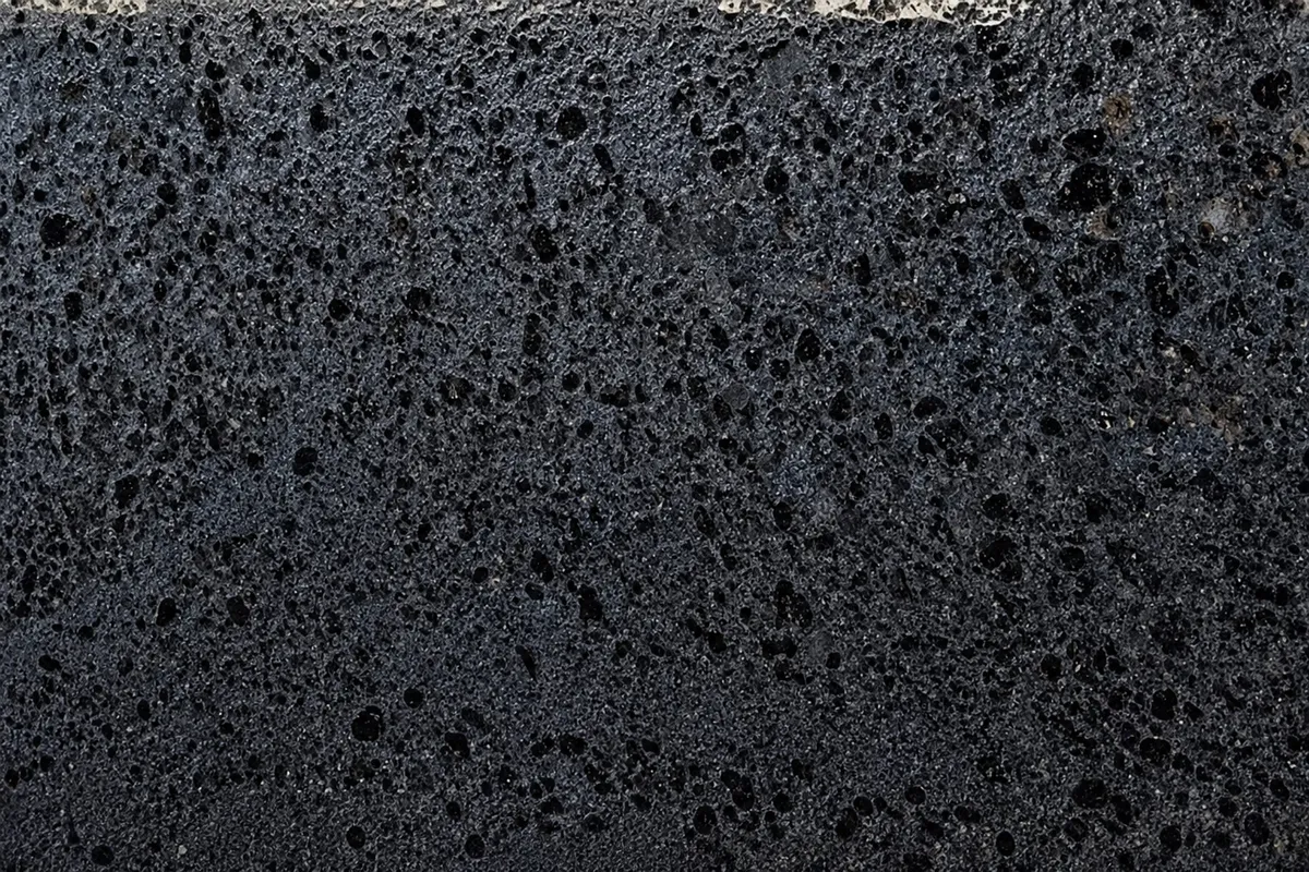
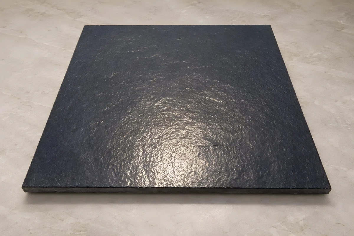
Textured to the touch, with the gloss taken off.
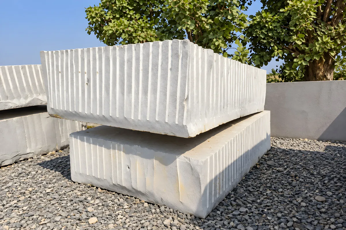
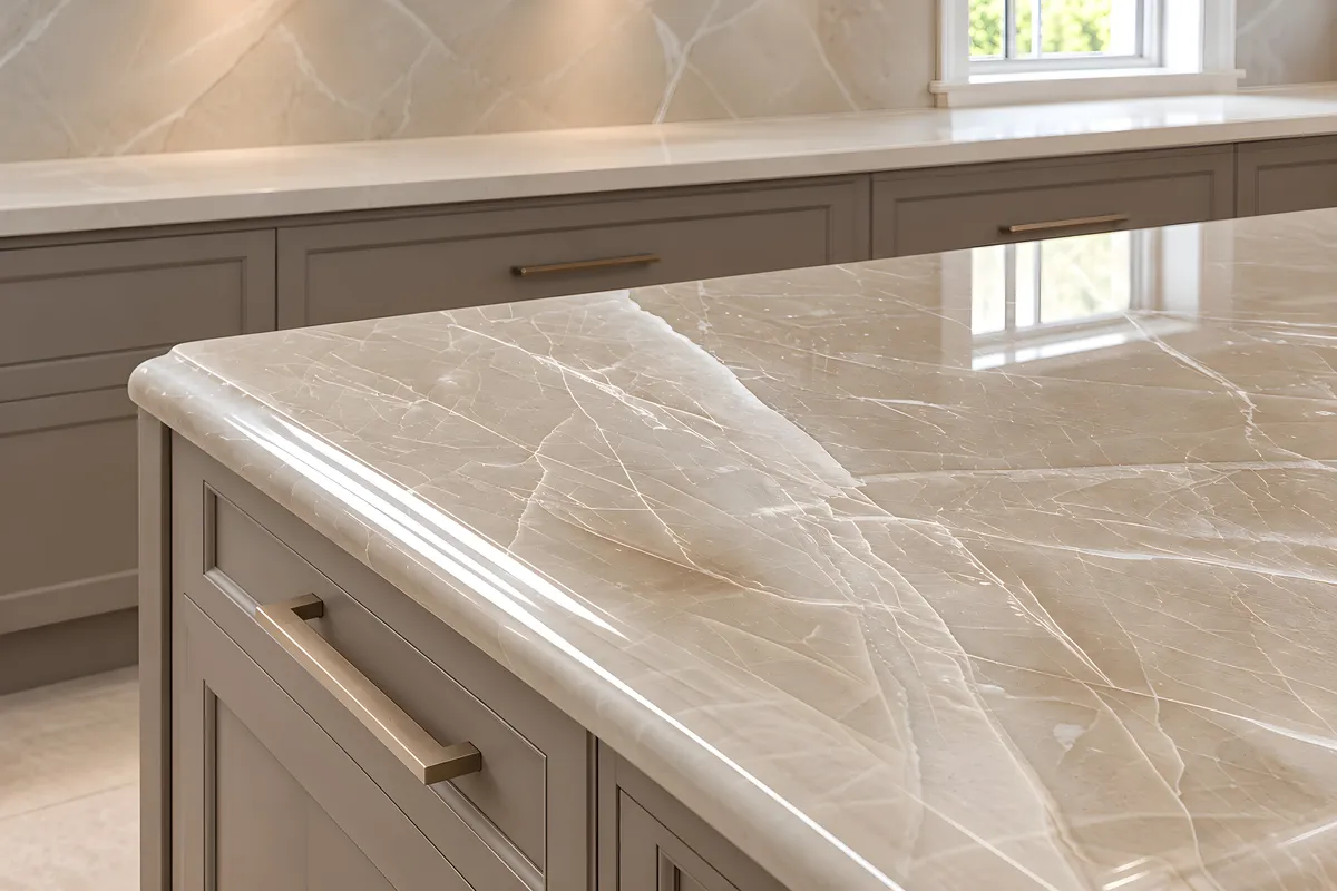
Reflective, saturating the colour and sharpening the veining.
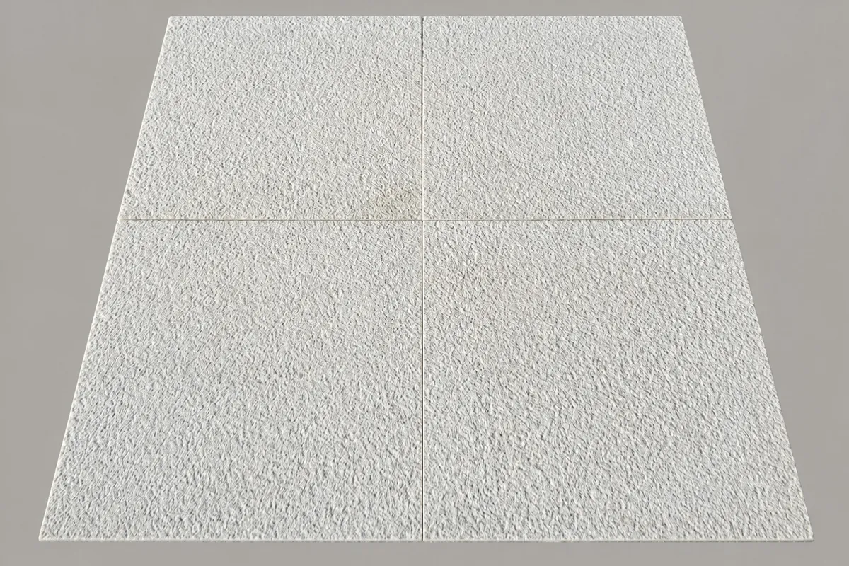
Open and grippy. The usual answer around water.
Sourcing
If none of these routes fit, tell us about the project and we will suggest materials directly.